Camp Hinterkind
PROJECT TYPE
Publication Production & Branding
ROLE
Publication Design & Production, Imagery, Content
TOOLS
Adobe Illustrator, Photoshop, & Indesign
DELIVERABLES
Publications
COLLABORATION
Bailey Perritte, Daniel Forrest, Mary Leslie
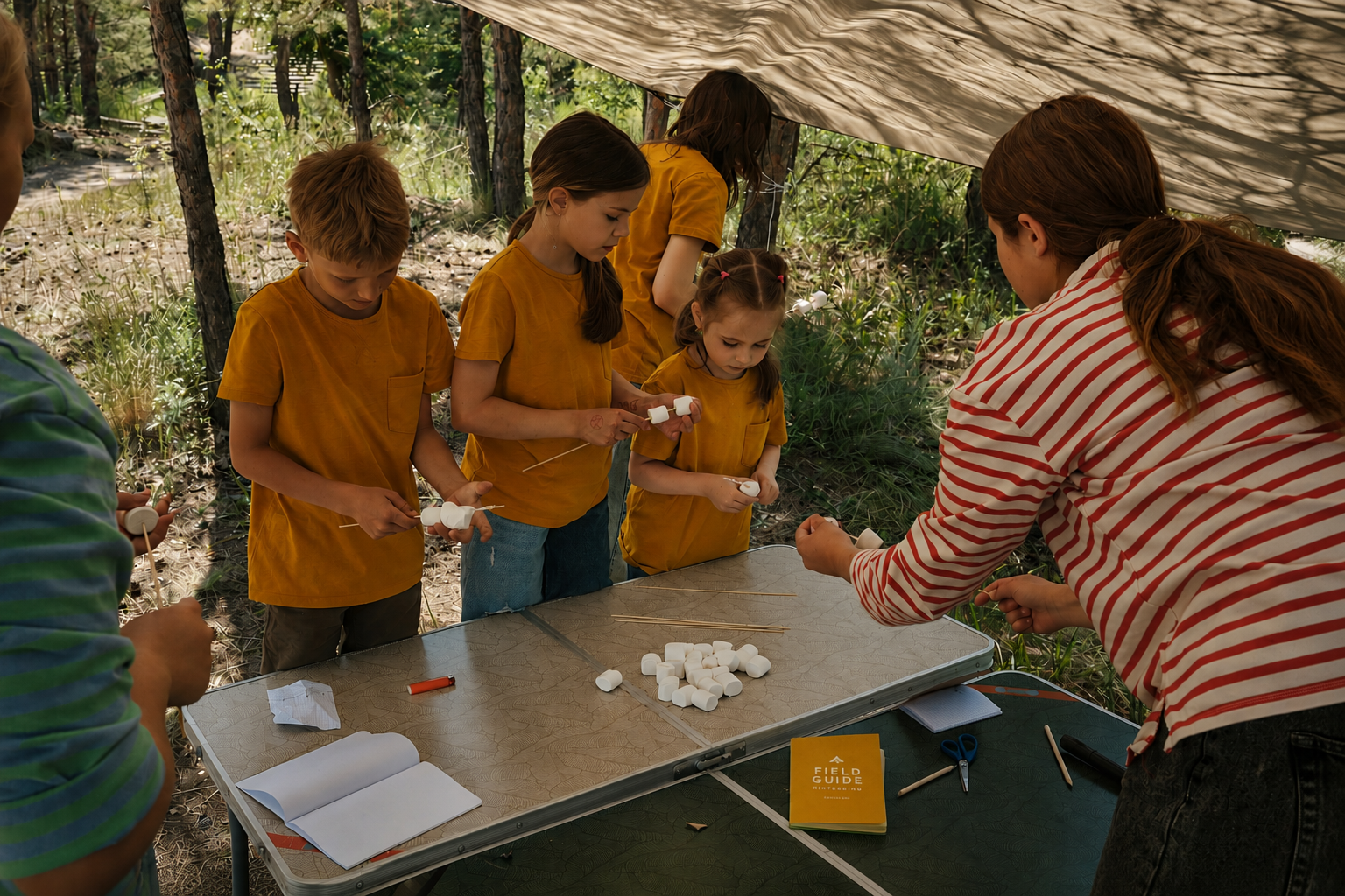
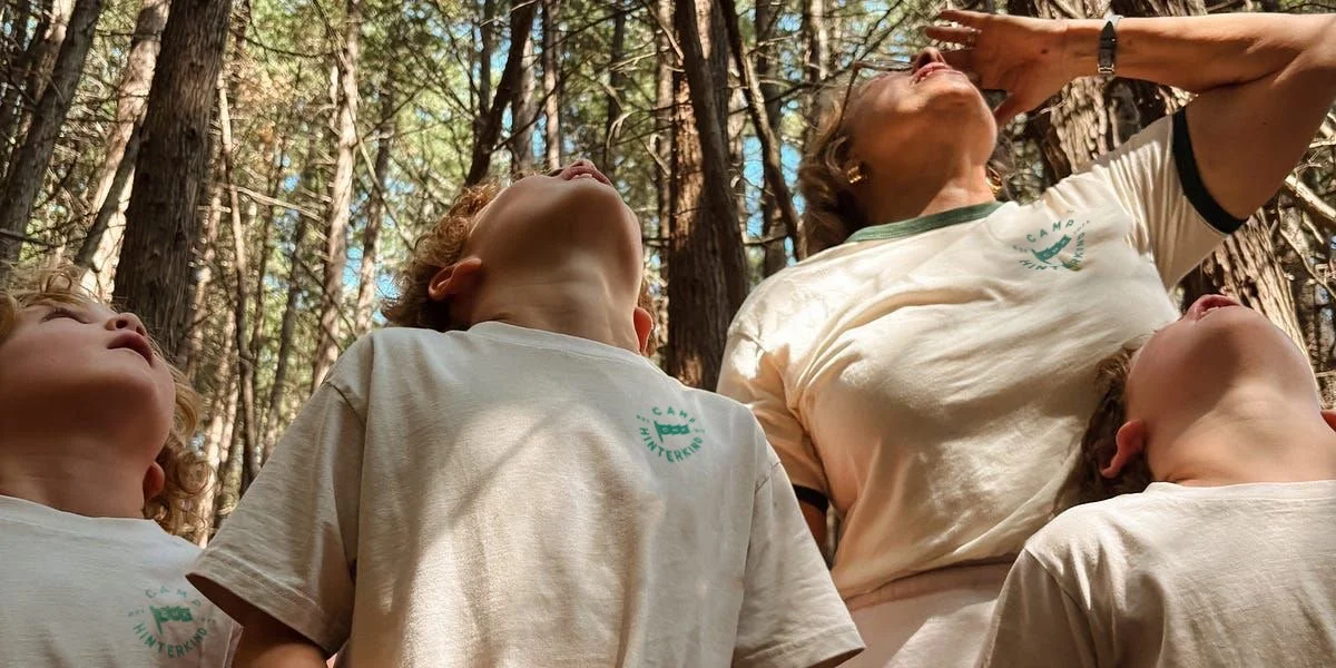
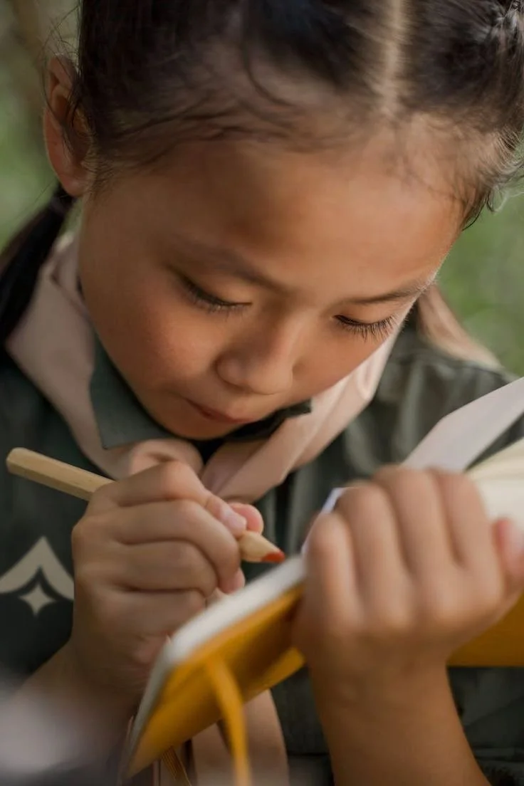
Camp Hinterkind is a children’s design camp located in Black Mountain, NC, aimed to provide children with a safe, immersive environment to explore and develop creativity. Inspired by past designers, the camp honors a shared commitment to teaching through making. With campers ages 11–18, the program is divided into two age groups and structured around Bauhaus inspired principles that balance foundational design education with hands-on exploration. Workshops introduce core skills before progressing into more focused disciplines.
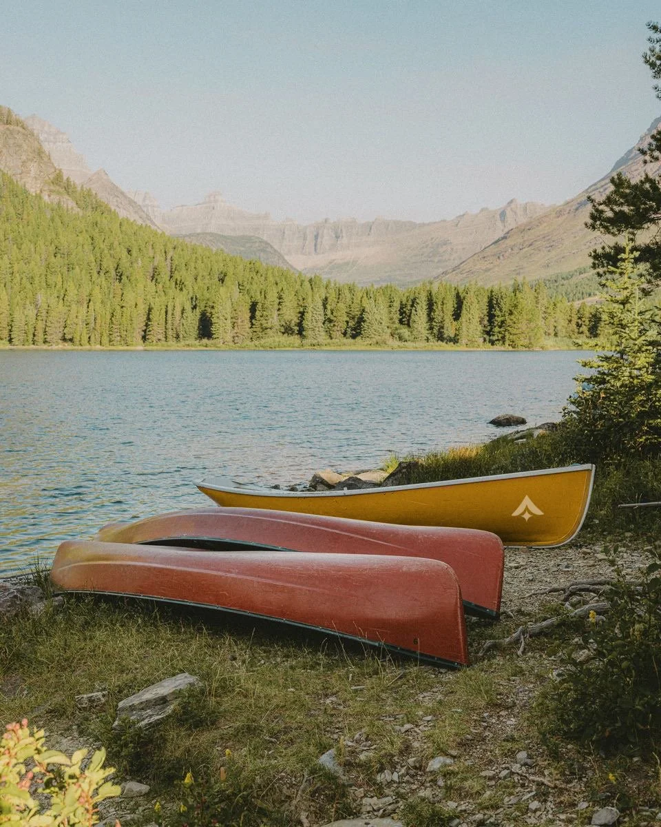
The camp’s visual identity draws from the International Style, using grids as a central organizing system to reflect the balance between structure and creative freedom that defines both design education and the camp experience. The name Hinterkind, translating loosely to “children of what lies beyond,” speaks to rediscovering curiosity through nature and nurturing an internal creative spark.
THE PROCESS
This project began with research into the International Style and the designers associated with it. As we studied their work, a common threme emerged: a strong emphasis on teaching, clarity, and accessibility in design. This insight shaped our brainstorming and sketching process, guiding us toward a concept that centered on learning and creativity. From there, the idea of a children’s camp took shape—one rooted in education, structure, and playful exploration.
THE BRANDING
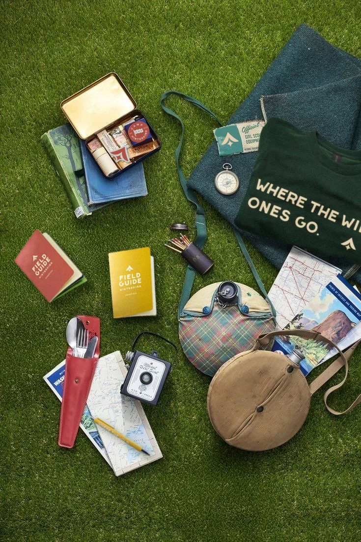
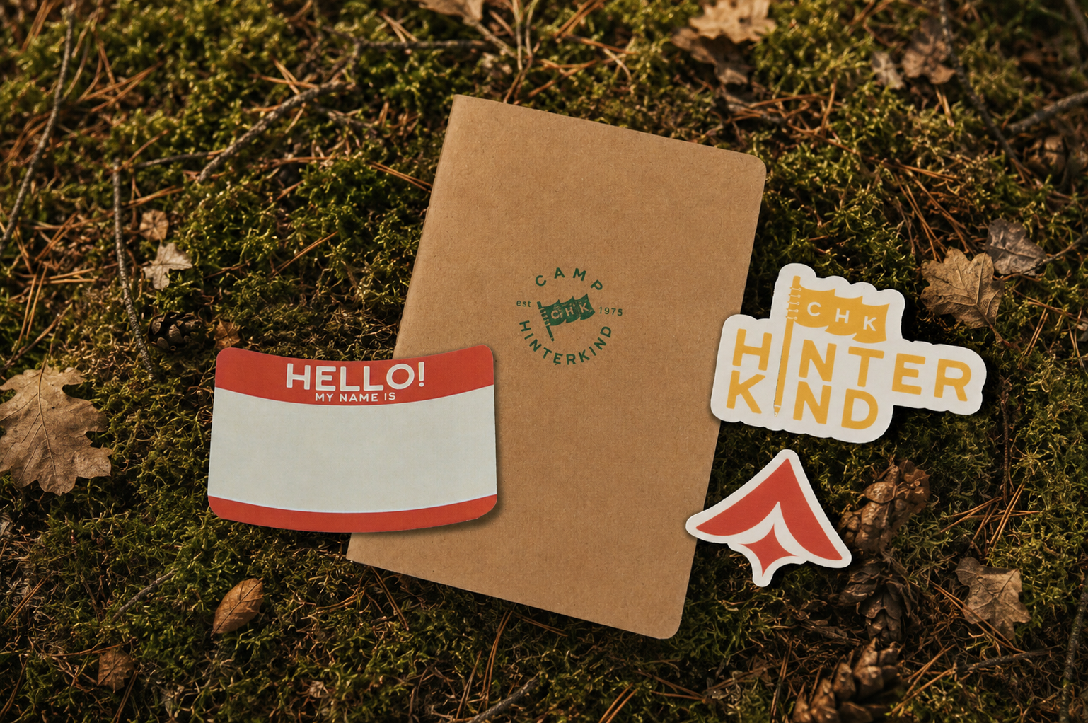
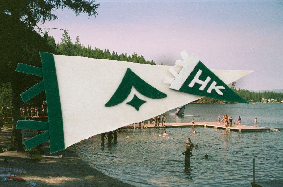
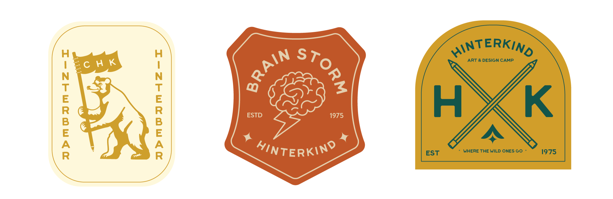
The branding for Camp Hinterkind is built around the belief that every child carries a creative spark, one that is nurtured, protected, and allowed to grow within the camp environment. This idea is reflected in the logo, where a spark takes the shape of a tent. Rounded corners echo the softness of the typeface, drawing inspiration from Bauhaus lettering and national park signage.
ICON system
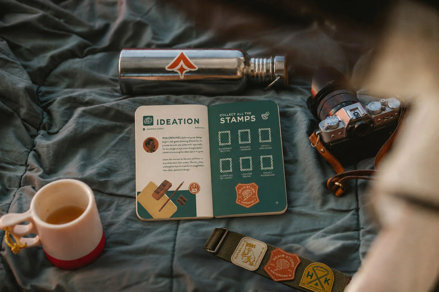
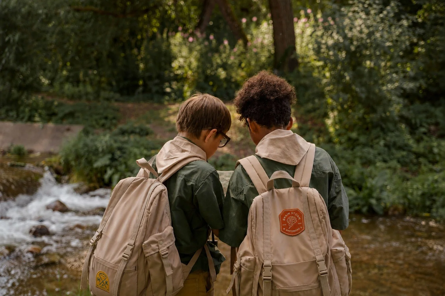
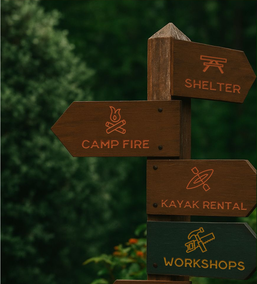
The icon system was designed to be simple and universal, reflecting the International Style’s emphasis on clarity and accessibility. Paired with a nature-inspired color palette, the visuals aim to feel intuitive and welcoming while remaining functional. Together, the icons and colors create a shared visual language that is easy to navigate and accessible to campers of different ages and backgrounds.
IMPLEMENTATION
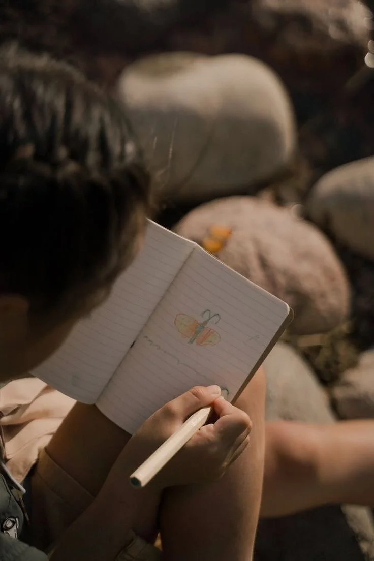
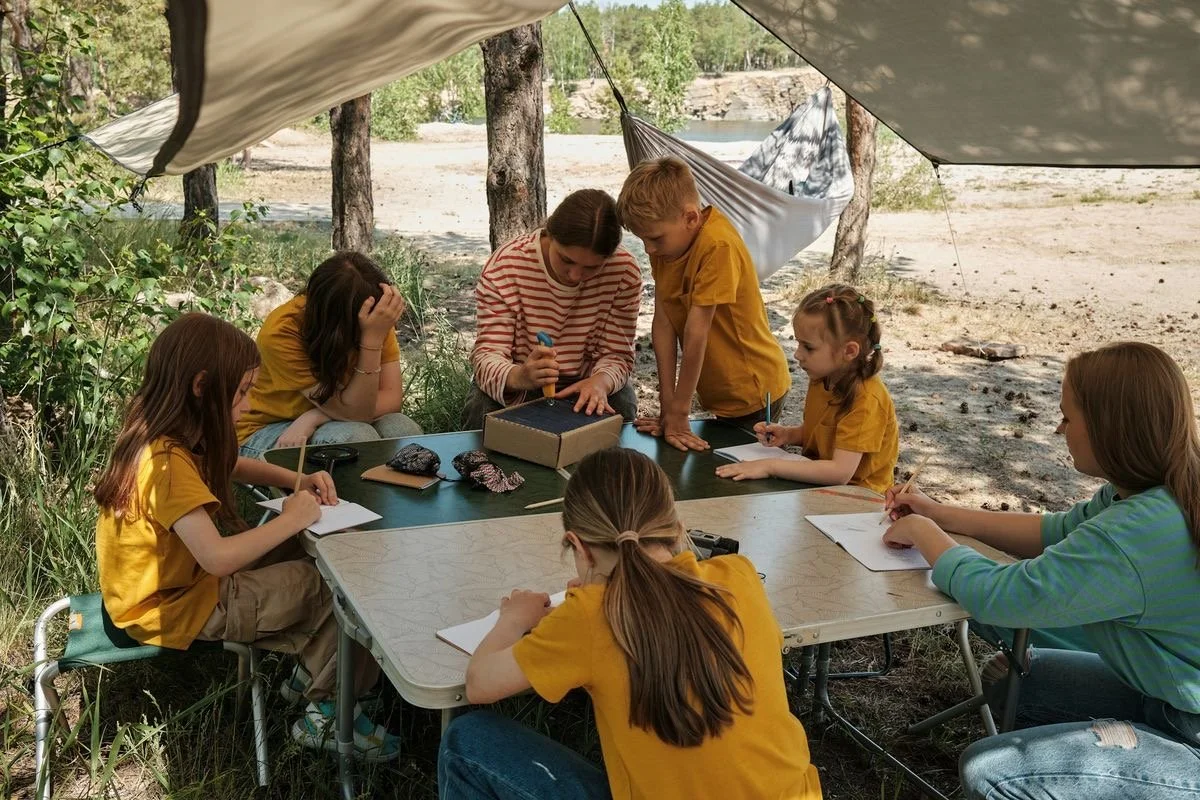
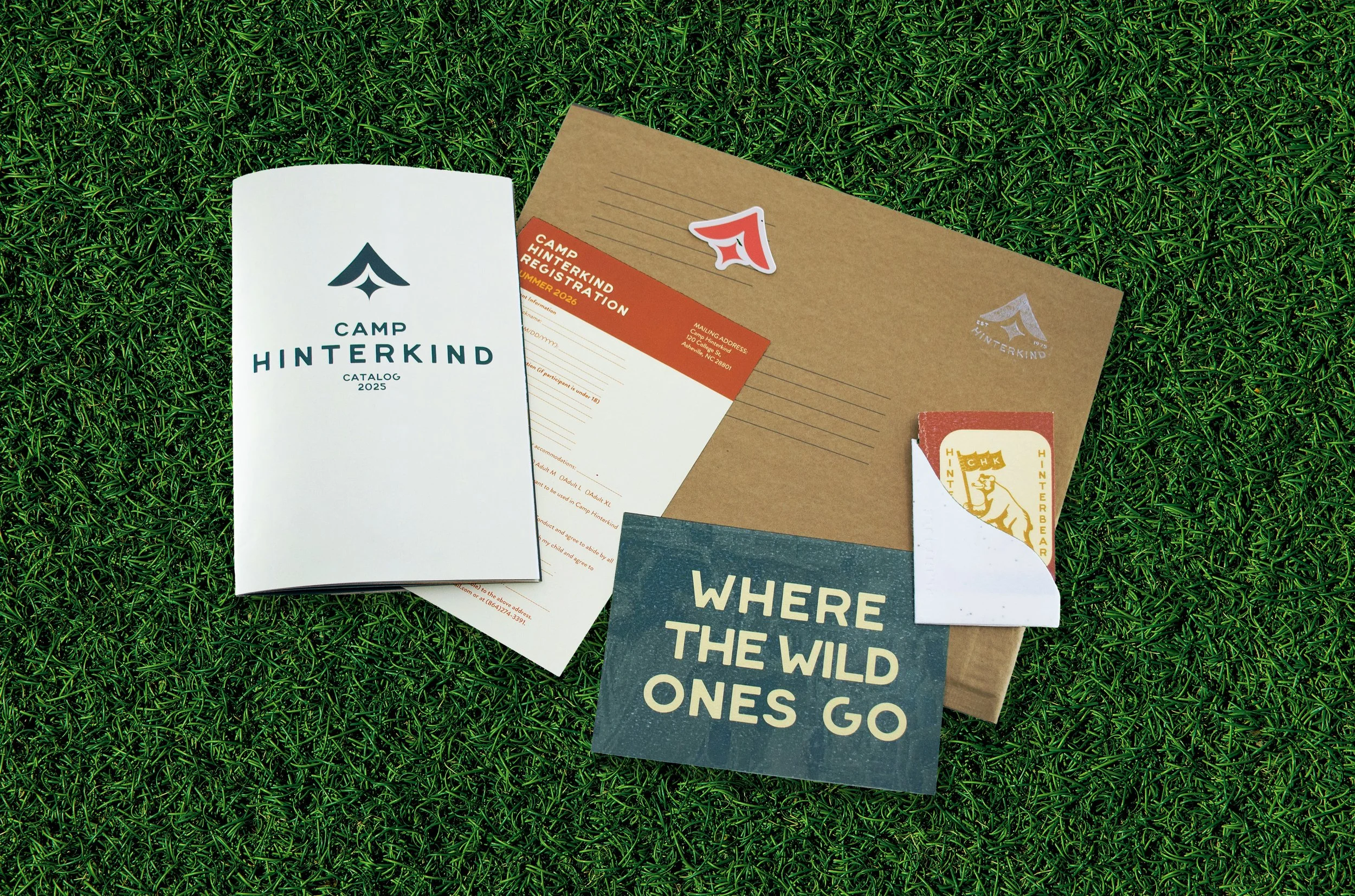
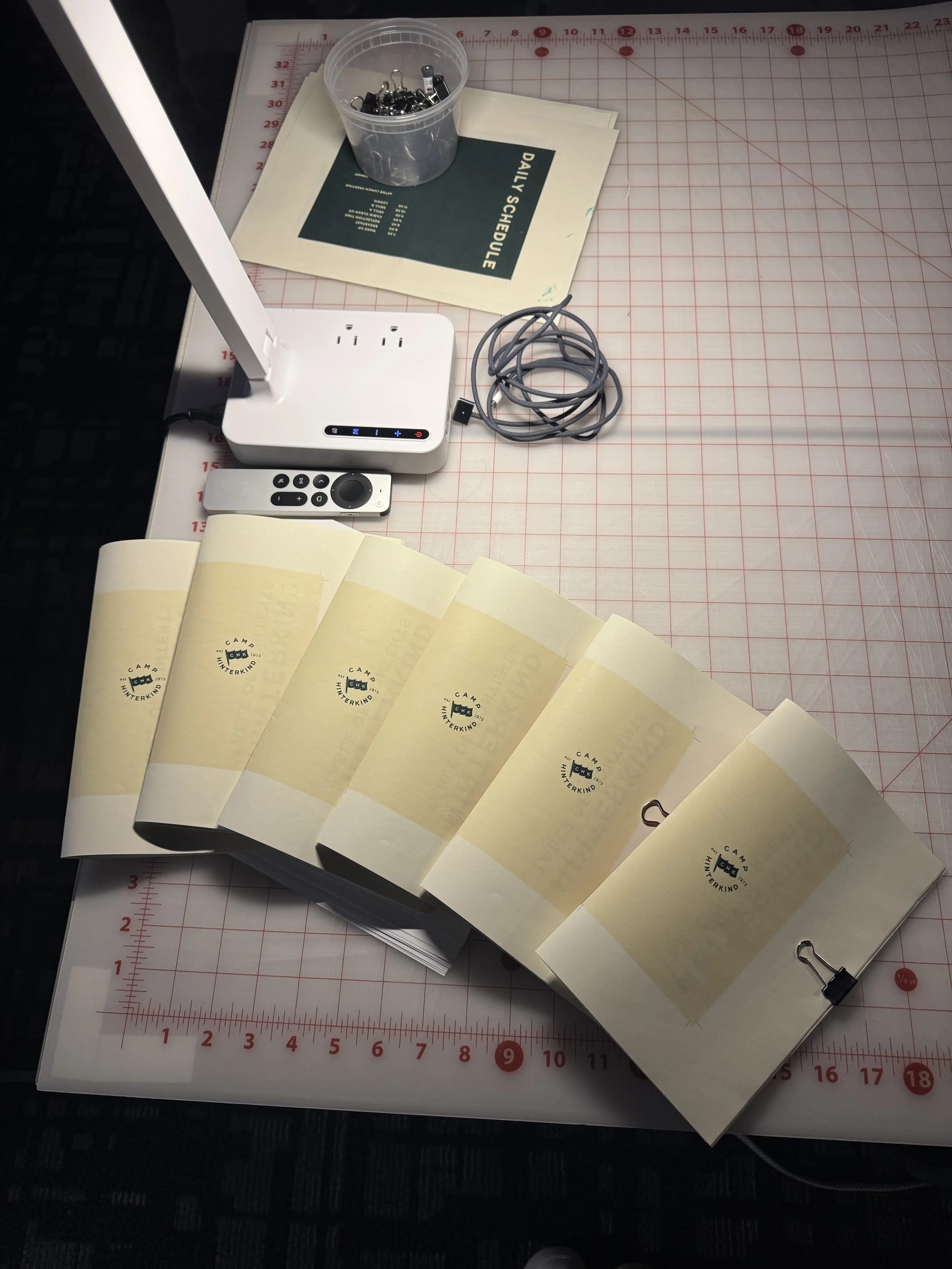
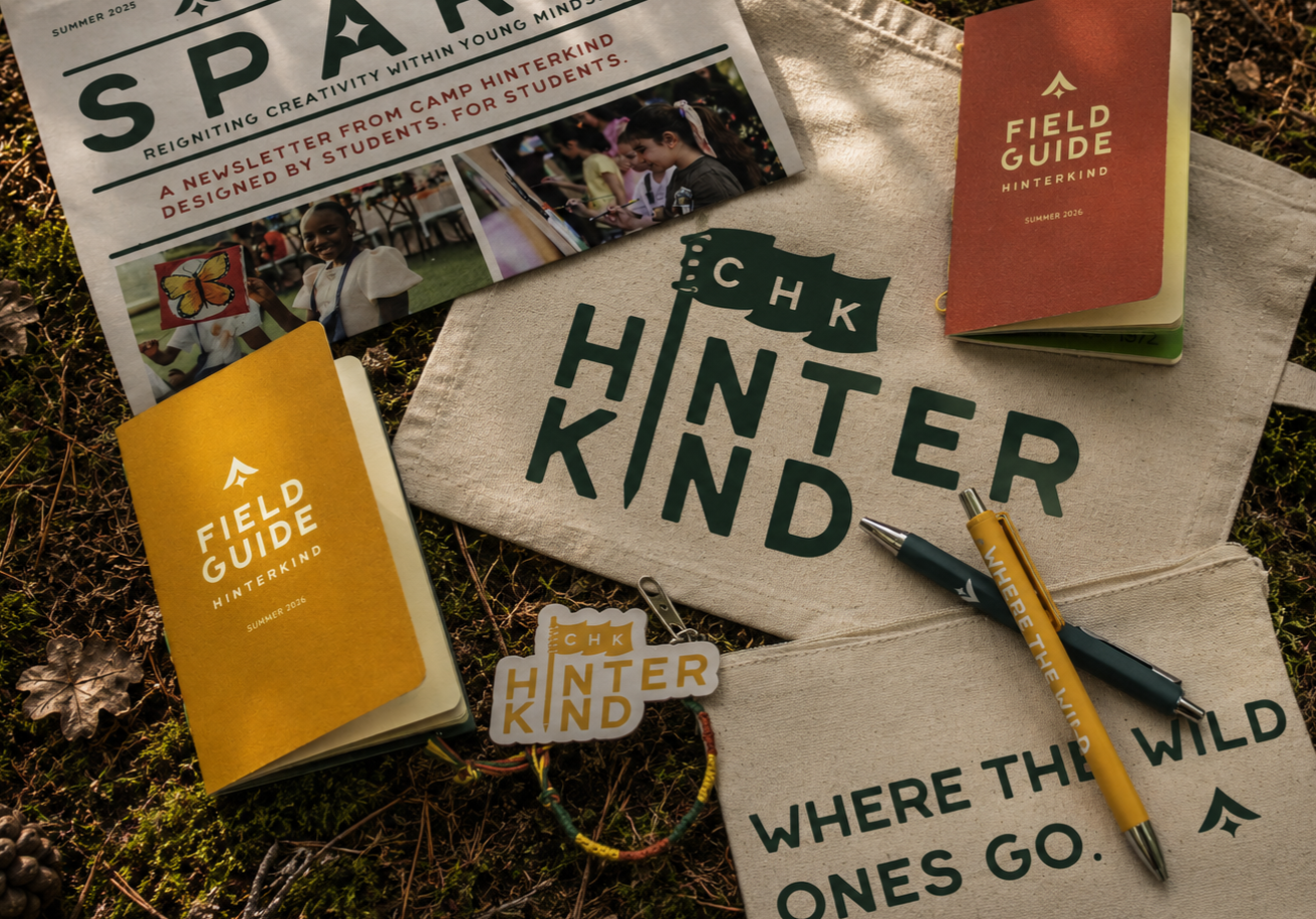
The field guides extend this philosophy, designed for daily use at camp. There are two versions—one for older campers and one for younger campers, the information curated specifically for each group. Each guide is small enough to be carried in a pocket and stitched together with thread. The guides include space for schedules, rooming details, sketches, notes, and badge collection, allowing children to actively engage, document their learning, and earn badges throughout their camp experience.
THE FINAL EXPERIENCE
From research and sketches to final branding and field guides, Camp Hinterkind demonstrates how a concept rooted in International Style principles can be translated into a practical, engaging experience. By designing tools that are accessible, adaptable, and playful, the project achieved its goal: giving children a space to learn and create, while honoring the legacy of the designers who inspired it.